
icitizen Homepage Case Study
User Research and User Experience design for an online polling platform that enables people to connect with their elected officials and influence decisions that affect them.


The icitizen homepage was due for some TLC.
It had remained mostly untouched since the initial release, and our analytics revealed that users were not actively engaged with the page content.
In order to support our business goals, we needed users to be engaged and voting in polls. So with that in mind, I set two goals for the project: 1) increase overall engagement and 2) increase the number of votes per user.

My process began with some user research and analysis of the existing homepage.
In general, the data indicated that users were experiencing confusion around the value and purpose of the site. Without a clear understanding of what to do here or why, they had little reason to stick around.

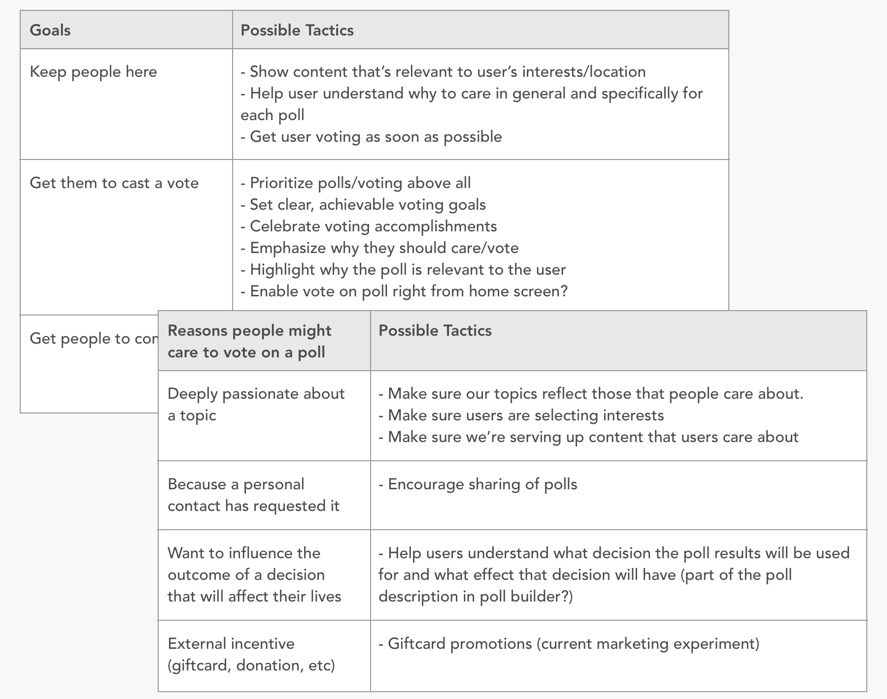
I brainstormed possible tactics for achieving our goals.
Generally speaking, we wanted to engage and retain users who would vote in polls on a regular basis (to serve our business goals).
We believed that users would see value in the presence of their elected officials and the ability to communicate with those officials by voting in polls and submitting ideas. We also hypothesized that users would be more engaged if the content was more obviously related to their location and interests.
Next up – exploration through wireframes and prototypes.
Early ideas included various ways of curating content and setting more overt goals for the user. I also explored ways of featuring elected officials more prominently and displaying data about one's community.
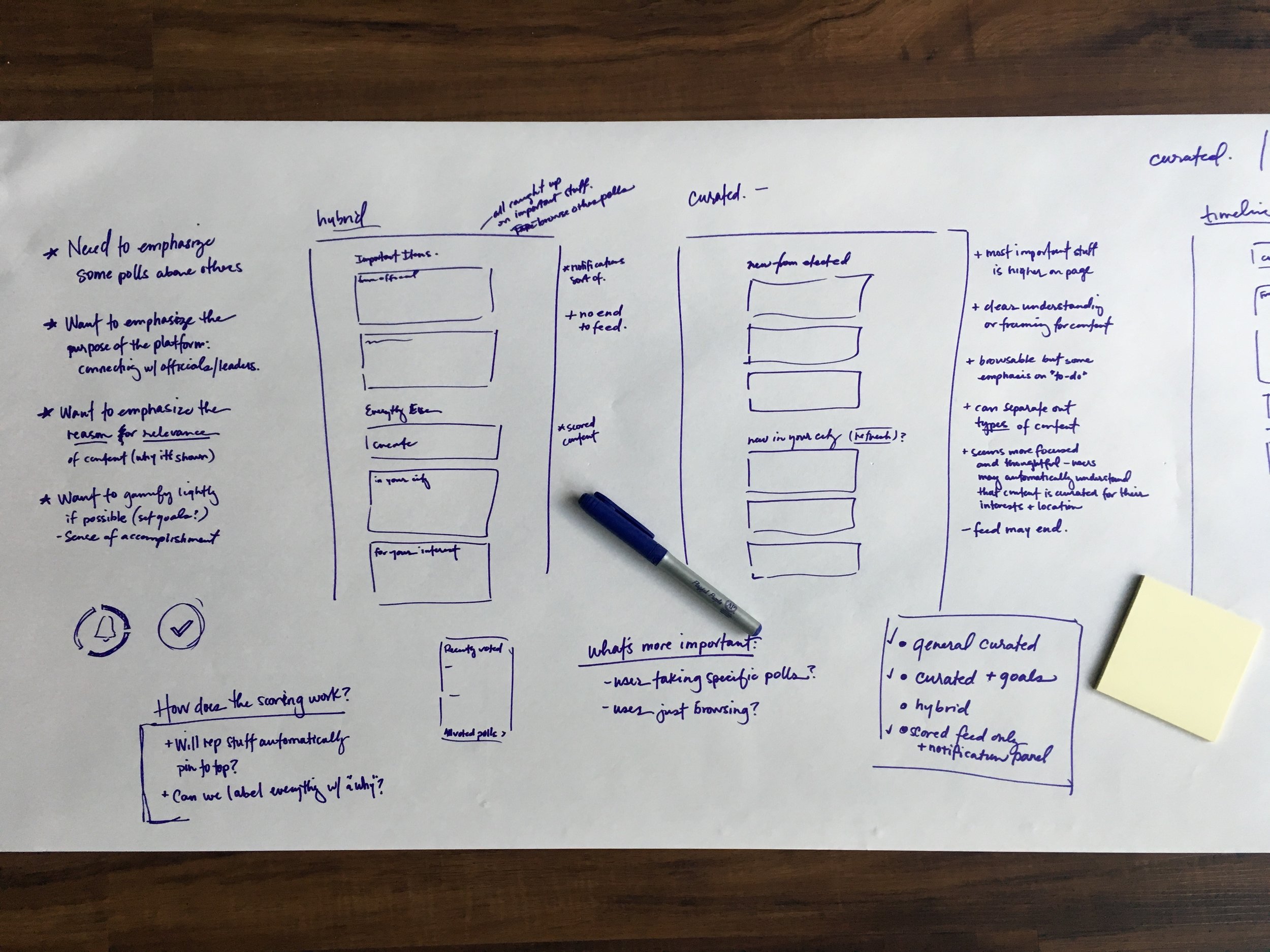


There was a lot of collaboration.
This phase of ideation and design involved a lot of collaboration with other teams. There were frequent touchpoints with product owners and other designers as well as meetings with developers to review and assess options.

I conducted user research to validate our ideas.
With InVision prototypes and UserTesting.com, I was able to gather valuable user feedback throughout the design process. The early data allowed us to iterate with purpose and gave us confidence in our final solutions as we moved toward development.

Finally, we landed on the right solution for our needs and available resources.
As is common with product development, we were looking to drive as much value as possible in this project without derailing our normal sprint cycles. In the end, we landed on a solid core experience that could be implemented within a reasonable timeframe and still improved upon with future iterations.
The main focus of the homepage is now a wide central column of polls and ideas. The content is presented in a single prioritized list to eliminate confusion about what to do first, and the majority of the screen real estate serves the main purpose of the site – voting.

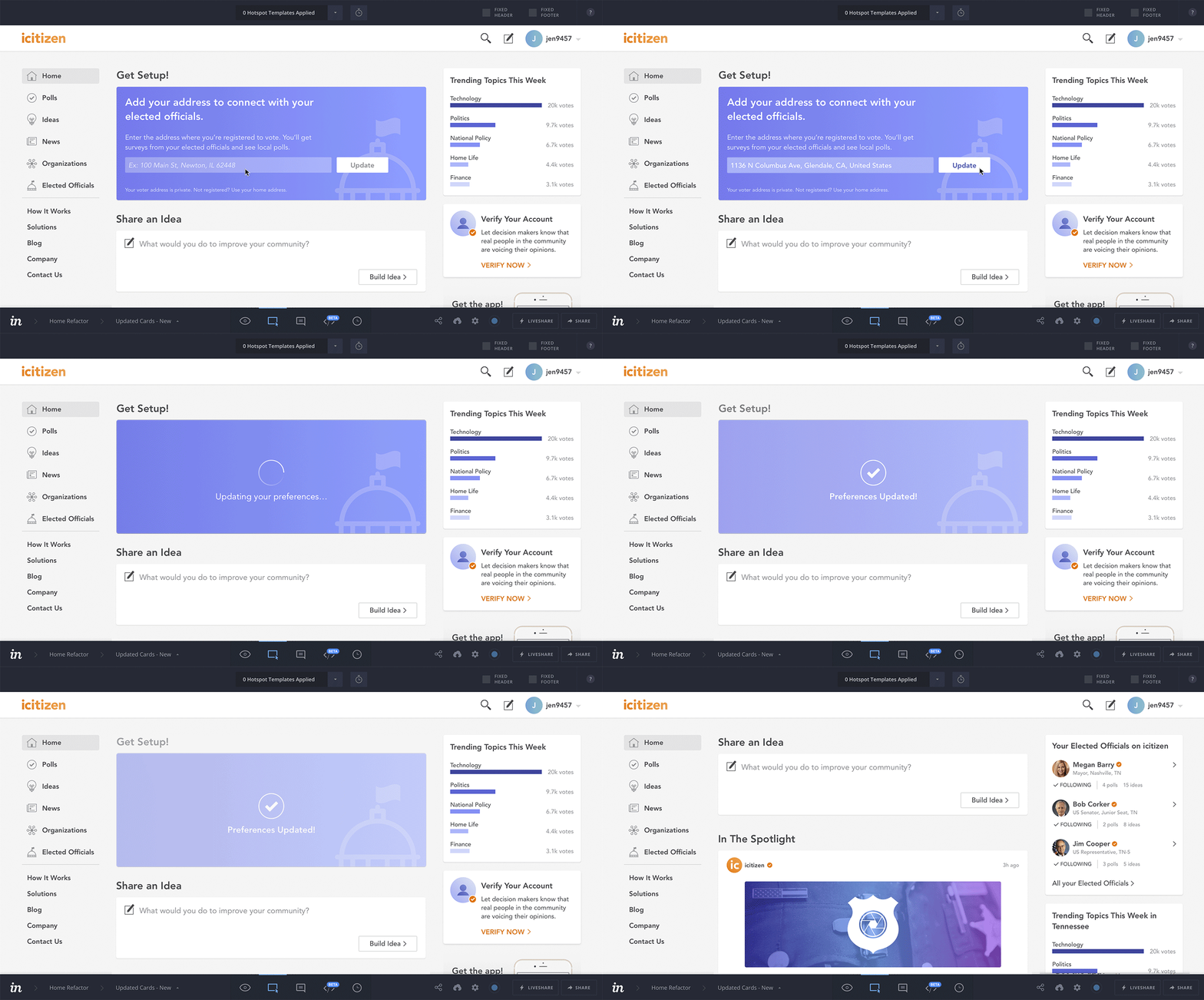
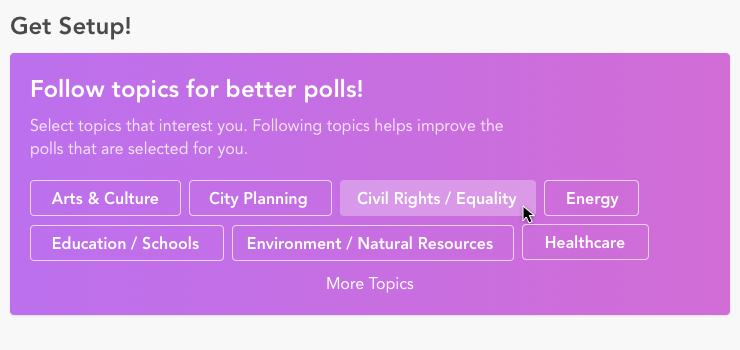
A new section titled “Get Setup!” prompts users for information that will greatly improve their experience on the site.
First, the location component is shown to allow users to locate their elected officials. It also provides a nice prominent reinforcement of the purpose and value of the platform.
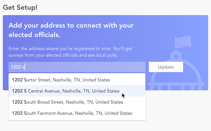
Next, the Topics component is shown to give users some control over the content in their feeds. It also subtly educates them about the types of content they may find here.
Prior to this project, only 22% of users had selected interests – a major impetus for including this piece.
After the user is setup, “Share an Idea” moves front and center.
Users were already able to submit ideas to their Elected Officials, but the tool was hard to find. This more prominent entry point is meant to increase awareness and engagement with the existing feature.

The new scrolling feed allows users to browse more content and is intended to engage them for longer periods of time. It’s also titled “Cast your vote” to make it crystal clear what to do here.
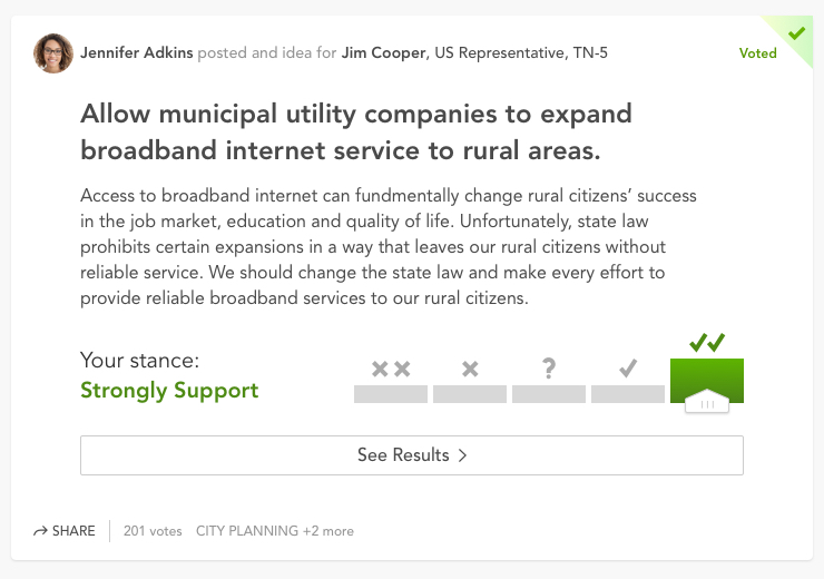
Polls from Elected Officials are prioritized and highlighted with special flags to draw attention to their presence on the platform. And users are now able to weigh in on Ideas right from the homepage – a feature we expect will encourage more votes.

The user’s officials are surfaced in a prominent place on the homepage. The main purpose is to emphasis their active presence on the platform. It’s also educational for users to discover who their officials are.
The “Trending Topics” piece displays the most voted-on topics during a 7-day span. It reinforces that the content is geared toward a user’s location and functions as an early step toward positioning icitizen as a source of useful data.


When it was time for development, I set my team up for success.
In addition to designs and prototypes, I like to provide spec to cover the details. I know questions arise during development, so I make a point to consider them in advance and deliver the information up front. The extra information also promotes accuracy when estimating required development time.


In just a few weeks after release of the new homepage, we began to see improvements in our key metrics.
We saw an increase in session duration, showing that users were spending more time on the homepage. There was also a lot of interaction with the new location and interest prompts, indicating that users appreciated the ability to customize their experience. And, the new feature allowing users to vote on ideas right from the homepage was a success, yielding an average of 1.3 votes per visitor!
Seeing the response to this first round of updates sparked new ideas for improvement. So we began again, seeking to further increase engagement and votes per user with a new round of iterations.
